
Teaching with Arclight and POE
Project Arclight began two years ago with an idea: If researchers can use Twitter analytics to study trends in discussions of contemporary media, then what if we treated historic trade papers and fan magazines like a giant Twitter stream and explored trends in film and media history? We worked on refining this idea, received a grant, kept working on it, and — just today! — publicly launched our software at http://search.projectarclight.org.
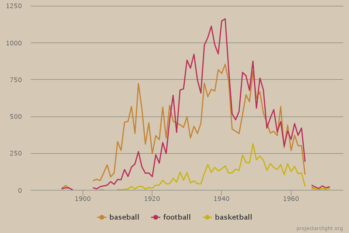
Arclight searches the nearly 2 million page collection of the Media History Digital Library (MHDL) and graphs the results. To provide one example — and an example very much inspired by this month’s baseball postseason, football season, and basketball preseason — here is a visualization of how those three sports trend across the MHDL corpus. Note: Because the MHDL’s collections primarily encompass out-of-copyright works, the results largely cut off after the year of 1964.
The team that developed the Arclight software — who are acknowledged at the end of this post — are working on a series of journal articles that model how Arclight and the method of Scaled Entity Search can be applied toward investigating large-scale research questions. However, we also hope that Arclight will be valuable as a classroom tool for teachers of film and broadcasting history, especially those teachers keen to expose students to digital humanities methodologies and engage them in active learning. Here are a couple of suggestions for film and media educators about how to use Arclight with your students.
The POE Strategy
For over twenty years, the POE strategy (which stands for Predict, Observe, Explain) has been a highly effective teaching method in the sciences. After being presented with a set of circumstances, students are asked to predict what will happen, observe an experiment, and then explain why it happened and compare their prediction to the outcome. When implemented well, it’s an exercise that actively engages 100% of students in the classroom — not just the two or three who might raise their hands to answer a question that the teacher asks aloud.
The POE strategy is ideal when used with science experiments that play out relatively quickly. What will happen when we mix these two chemicals together? Make your prediction, then observe and explain why the result occurred. But POE can be challenging to implement in a history classroom. If a teacher says, “and guess what happened next?,” then it can certainly facilitate student prediction. But it also perpetuates two unfortunate dynamics. First, the instructor, who reveals the correct answer, becomes reinforced as the authority on the historical record. Second, history is presented as a fixed narrative, rather than as a set of assumptions and arguments that we are always challenging using the available evidence. We need ways to more actively engage students in their learning. And active learning, in a film and media history classroom, means that students get to spend class time doing the work of a film and media historian.
Arclight offers one means of integrating POE and active learning into a film or media history classroom. To use my earlier graph example, a teacher might ask, “How did the discourse of sports change from 1900 to 1960 in books and magazines about American entertainment and media?” Students could write down their predictions, then get to work on their computers or phones running queries for baseball, basketball, football, and other terms in Arclight. Something might immediately jump out at them. For me, it was the decline of both baseball and football during the years of 1942, 1943, 1944, and 1945. Based on this observation, I would offer the explanation that this decline of baseball and football occurred due to the impact of World War II and the enlistment of athletes into armed forces.
But really, this explanation based on distant reading is a new prediction that invites closer inspection, observation, and analysis. Put another way, Arclight is best used with the POEPOE or POEPOEPOE strategy. Any explanation a student offers can and should be further tested. Does the rise of football in the late-1920s and 1930s have more to do with radio coverage or football’s popularity in short films? We need to dig deeper to find the answer.
In developing Arclight, we felt it was important to give users the ability to easily and fluidly access the underlying texts. We were able to achieve this by integrating Arclight with the MHDL’s search engine, Lantern. Students can click through the Arclight graph and access the underlying materials within Lantern. Teachers will also want to encourage students to consult primary sources that are NOT indexed within Lantern, like archival manuscript collections and historical newspapers. Still, Arclight and Lantern provide a fast, user-friendly way for students to actively engage in historical research and analysis within a classroom.
The SES Interpretive Triangle and Changing Graph Views
There is another interpretive method that teachers may want to consider alongside POE.
The line graphs in Arclight are not arguments. They are simply visualizations of how many MHDL pages a given term appears in per year. To help students more fully think through what they are seeing, teachers might ask them to think about the relationships between the terms they are searching, the books and magazines they are searching within, and the impact of digitization and search algorithms within the process. We call this the Scaled Entity Search Interpretative Triangle. And if this sounds big and confusing, see Kit Hughes’ blog posts on the Scaled Entity Search (SES) technical method and interpretive method.
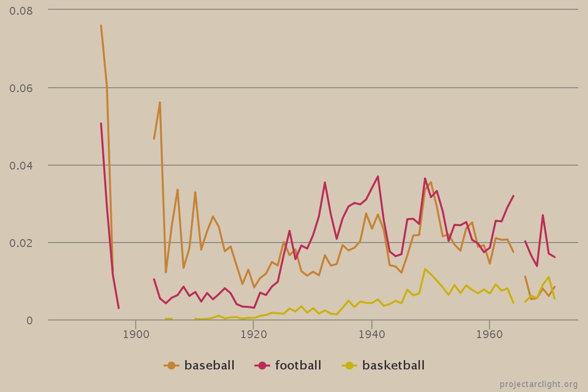
On an interactive level, students can change their visualization and reflective on the corpus and digitization by clicking on the dotted line icon and/or percentage icon. The dotted line icon graphs the MHDL’s entire corpus, revealing how some years have way more pages indexed than other years. The percentage icon helps correct for this by “normalizing” the data that is being visualized by dividing the number of page hits per year by the number of total pages per year. In other words, the normalization feature accounts for the fact that more pages were scanned from some years than others. And in the case of the sports visualization, the trend lines change quite a bit — especially in the stability of the lines from the late-1940s through the mid-1950s:
Ultimately, no visualization is perfect, nor should it be. By offering users a variety of visualization options and the ability to access the underlying data, we hope to drive home the understanding that all graphs are incomplete abstractions and best used as jumping off points into further analysis. Yet they are valuable precisely because they may lead us toward analyses and questions that we otherwise would have never considered. And we hope that you and your students may even have fun creating, changing, and playing with these visualizations.
Please give Arclight a try with your students and let us know how it goes. We hope that it allows students to playfully engage in historical exploration and come away with valuable lessons about digital technology too. We are all living in a big data world. We have long trained our students in how to closely read a singular text. We need to complement this with more teaching activities that encourage analyzing many texts at a large scale — and dealing with all the uncertainty and messiness that goes along with it.
Acknowledgements:
This project was developed by teams at the University of Wisconsin-Madison and Concordia University and sponsored by a Digging into Data grant from the U.S.’s Institute for Museum and Library Services and Canada’s Social Sciences and Humanities Research Council. Additional support came from the University of Wisconsin-Madison’s Office of the Vice Chancellor for Research and Graduate Education and Concordia University’s Media History Research Centre.
The Arclight Software Development Team is Comprised of:
Project Directors: Charles Acland and Eric Hoyt
Interface Design and Programming: Kevin Ponto and Alex Peer
Search Index Development: Eric Hoyt, Kit Hughes, Derek Long, Peter Sengstock, Tony Tran
Thank you also to broader team and community who contributed to Project Arclight.
One final thanks…
The author wishes to thank the Madison Teaching and Learning Excellence (MTLE) program. Without MTLE, this media scholar would never have learned about POE or adopted the strategies of active learning.

