
Marvel, Wired? Daredevil and Visual Branding in the MCU
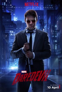
Figure 1: Texturally rich costuming of Matt Murdock character in Daredevil.
Post by Piers Britton, University of Redlands.
How far are Marvel Studios’ film and television franchises visually coded for homogeneity? How insistently, that is to say, is brand identity maintained at the levels of design, cinematography, editing and post-production processing? This question seems worth pursuing in relation to Marvel’s Daredevil (Netflix, 2015), which has already been critically positioned as divergent from prior entries in the “Marvel Cinematic Universe” super-franchise. All the MCU films since 2008 have been rated PG-13, while the ABC television series Marvel’s Agents of S.H.I.E.L.D. (2013–) and Marvel’s Agent Carter (2014-15) are consistently anodyne, even at their darkest. Daredevil, by contrast, is already notorious for its frequent and intensely graphic violence, which earned it a TVMA certification, and for the conflicted nature of its anti-heroic protagonist. This shift in tone is not the only departure from the prior Marvel norm. Much more assertively than Agent Carter, and even more than the DC offerings on the CW, the new show emphasizes that its protagonist is one of Marvel’s “street-level” superheroes, with the action never straying beyond Hell’s Kitchen and the narrative focusing heavily on the socially disadvantaged and marginalized. While it is not the first Marvel property to introduce comic-book characters without their familiar costume trappings and idiosyncrasies of grooming, Daredevil has arguably gone further than its predecessors in this regard. For example, the series reduces the comics’ hirsute, flamboyantly coiffed and green-ulster-clad Leland Owlsley (Bob Gunton) to a deceptively avuncular elderly man with thinning hair and a short back and sides, dressed in earth-toned tweeds. Indeed, Daredevil even deprives Matt Murdock (Charlie Cox) of his red superhero suit until the climax of the final episode.
Showrunner Steven DeKnight has underscored the ways in which Daredevil differs visually from network series like Agents of S.H.I.E.L.D., noting that he and his D.P., Matt Lloyd, “wanted to be able to do a show that was literally darker than what you would see on a network,” where series tend to be “very bright, very evenly lit,” and further that they “wanted to take more of the color palette of the classic movies of the ’70s, the Dog Day Afternoon and French Connection and Taxi Driver.” The series’ production designer, Loren Weeks, also emphasizes Daredevil’s departure from the sleek, well-appointed and technology-rich environments that typify Marvel’s cinematic tales of billionaire playboys, demigods and super-soldiers. Tellingly, Weeks claims: “We’re more The Wire than other Marvel movies. It’s not the stuff you see in Agents of SHIELD, it’s the stuff you see every day.”
Stress on the quotidian, invocation of the ultra-realist Wire, insistence on chiaroscuro lighting (with its inevitable noir associations), and reference to the subdued palette of dour seventies thrillers all serve to distance Daredevil not only from other Marvel properties but also from other broadly cognate television shows. They rhetorically position the series as something “grittier” than the quasi-realist narratives of street-level superheroes in Arrow (CW, 2012–) and The Flash (CW, 2014–). Indeed, if there is a DC comparison to be made, it is with the notoriously tenebrous and bleak Dark Knight films. So, if we are to take Weeks’ and DeKnight’s remarks at face value, how does the visual style of Daredevil fulfill the branding imperative of offering variety within identity and novelty within continuity?
A number of recurrent or repeated visual motifs both in Daredevil’s paratextual materials—posters, publicity stills, and so on—and in the episodes themselves serve to weld strongly to Marvel’s other film and television, and to its comic-book lineage. Use of strong color in Daredevil represents the most interesting variation on established Marvel brand elements. MCU style in toto is defined by chromatic intensity and richness (in contradistinction to the DC film and television “multiverse” that has gradually developed since Batman Begins). Dominant color values have varied, with Phase Two movies and the second series of Agents of S.H.I.E.L.D. frequently exhibiting lower values and lower-key lighting than Phase One. Even so, selective, punctuative use of high-intensity colors is endemic to Marvel’s television and film offerings. Only the environments and personnel of S.H.I.E.L.D. are stripped of high value and saturated color; otherwise, the heroes and villains and their worlds are as bright as the Marvel logo, and the comic-book pages we glimpse in the animated version of that logo that heads each film and television show from the MCU. In most cases, focal points of vibrant color are typically located one way or another on the bodies of the protagonists, from Iron Man’s scarlet and gold livery to Peggy Carter’s blue suit, white blouse and red hat (used so extensively in publicity materials for Agent Carter), and from Thor’s flaxen hair to the Hulk’s green skin.
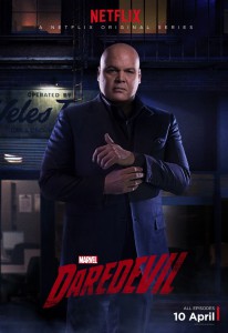
Figure 2: Superficially neutral costuming of Wilson Fisk character in Daredevil
Daredevil largely displaces intense color from bodies, except in the case of the saturated red costume worn by the “ninja” villain, Nobu (Peter Shinkoda), in a watershed fight scene. As befits a faux-realist television series, and especially one that unfolds over thirteen instantly reviewable episodes, the devil is in the details in Stephanie Maslansky’s costumes; bold gestures are correspondingly few and far between. Thus Matt Murdock’s suits are mostly mid-value monochrome but his clothes are texturally rich—shirts, for example, are nubby oxford rather than smooth poplin—suggesting the blind man’s heightened reliance on tactility (Fig. 1). By the same token, wisecracking Foggy Nelson (Eldon Hensen) is also superficially neutral in his dress, but the printed shirt fabrics and animal-motif ties reward leisurely, close inspection and add a “quirky but not flamboyant” note – and so on. Unmodified strong color is eschewed in inverse proportion to the dominance of all these surface nuances, a choice that is most notable in the reimagining of principal antagonist Wilson Fisk (Vincent D’Onofrio). The white suits and ascot of the comic book Kingpin are relegated to an “Easter egg” joke in the fifth episode, while Fisk’s open-necked silk shirts and mohair-tonic, three-piece suits for the series are either black, gray or muted blue, the surface of the latter sometimes broken up with self-stripes that further mitigate saturation (Fig. 2).
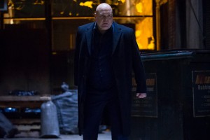
Figure 3: Vivid lighting in Daredevil.
Vivid color is mainly a property of environments, and more specifically the illumination of environments, in Daredevil. Murdock speaks of experiencing “a world on fire,” and in addition to a couple of livid-red POV shots simulating this for the audience, the idea is echoed each episode in the opening credits, which show New York landmarks and finally Daredevil himself forming viscously out of a red haze. A no-less insistent leitmotiv is the acid yellow and green light suffusing the panes of the picture windows that are endemic to the various warehouse and loft spaces in which so much of the nocturnal action takes place — including Murdock’s own apartment (Fig. 3). This sickly glow can in most cases be rationalized as light pollution from neon signage and street lamps (the now celebrated hallway fight from the second episode is one of the exceptions), but this is ultimately beside the point. The device is surely used chiefly because the grid of glazing bars in these windows provides a strong, stylized, quasi-graphic backdrop to action – and perhaps because both the strong color fields and insistent linearity recall the simplified backgrounds beloved of comic-book inkers and colorists (Fig. 4).
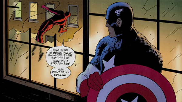
Figure 4: Example of simplified backgrounds of classic comic books.
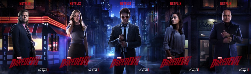
Figure 5: Netflix’s posters for Daredevil.
Very little of this disembodied color creates as potent an effect as Netflix’s Hopperesque banner and posters for Daredevil (Fig. 5), which feature a cityscape bathed in the super-intense blue that hyperbolically represents nighttime in screen media as well as some comic strips. It is in these paratextual images that the “Marvelness” of Daredevil is perhaps most economically and powerfully expressed. Even so, and notwithstanding analogies with The Wire and Dog Day Afternoon, Daredevil’s imagery consistently reflects the fact that, as Loren Weeks puts it: “We didn’t want to be too literal with the real. It is the Marvel universe, after all.”


Piers,
I very much enjoyed reading your post. It’s interesting seeing these two major comic book companies and the different stylistic routes their film franchises are taking. As you say, Marvel is going the more colorful route.
DC is taking the “grittier” direction with muted colors. “Man of Steel” received much notoriety for this (and still does). The upcoming “Justice League” movies will likely adhere to the same look. There’s also the somewhat recent pictures of Jason Momoa and Gal Gadot as the new Aquaman and Wonder Woman, respectively. Missing are the bright colors, especially Aquaman’s signature costume with the orange upper body.
Do you think the directions of style each “super-franchise” (as you put it) reflects their emotional tones? Marvel’s movies of the MCU seem to balance the “end of the world” stakes with humor. DC, judging by “Man of Steel” and the teaser for “Batman v Superman,” seems to be committed to somber tones and being mostly humorless.
Also, I’m wondering if you have any additional thoughts on the language and graphic bloody violence in “Daredevil.” While I loved the show, I was very surprised by some of the things said and by the sheer amount of blood. Not offended, just surprised to see these things in a Marvel show. As you said above, Marvel movies sticks to PG-13 ratings, so there is the violence and destruction, but it’s largely not bloody. Could this be due to Daredevil’s status as a “street-level” superhero? A superhero who is lower on the ranks, so he gets the messier, rougher jobs?
Thank!
– Ryan
Ryan:
Apologies for taking so long to respond to your comment, for which much thanks. Let me try to address your two questions, which are both on issues that for reasons of space or complexity I didn’t tackle in the original post — but upon which I did reflect.
Until “Captain America: The Winter Soldier” I would certainly have said that there was consonance between high value, high intensity color and emotional tone in the MCU. As you say, whimsy and wit are frequently to the fore. While even the Phase One films can go to bleak places and frequently revolve around near-apocalyptic events, tonally the MCU movies are really not that far from musical comedies, which from one pointe of view they also resemble in their melodrama and emphasis on colorful tableaux and dense, elegantly realized choreography. The self-conscious evocation of films like “Three Days of the Condor” in “Winter Soldier” led to a one-off departure from that established tone, shifting the franchise much closer to DC offerings than prior Marvel films and the network TV series. “Winter Soldier” certainly represents a precedent of sorts for the grittiness of “Daredevil” in terms of emotional tone, for it’s all metaphorically shades of gray — though literally it is, as I’ve suggested, more strongly infused with color.
As to the issue of blood: well, this is obviously one important manifestation of saturated color in “Daredevil” that I didn’t mention. That Matt Murdock so copiously bleeds, and so thoroughly bloodies his opponents, is surely at one level a function of his belonging to the recognizable, quotidian world, though I do wonder whether this level of untidy violence would have been so strongly evident if Joss Whedon had had his way and “Daredevil” had been rebooted as a movie. It seems to me that context is all, and that the relegation of Murdock, Jessica Jones, Danny Rand and Luke Cage not merely to television but to Netflix is significant. While I suggested in my post that vivid color is one of the ways in which brand consistency, and thus potentially brand equity, are upheld in “Daredevil,” in emotional tone there’s no question that it’s pushing the envelope. For Netflix, however, it’s nothing new; on the contrary, it’s a pretty logical extension of the prevailing tone of their original programming, picking up in different ways in the moral and visual murk of series like “House of Cards” and “Hemlock Grove.”
That said, if Netflix can be understood as a natural home for the grittier, more ambivalent end of Marvel, it’ll be interesting to see whether at any point the movies do embrace a harder-edged, grittier tone, and deal with superheroes who are less super — and less heroic, or at least less amusingly anti-heroic than Tony Stark. My guess is that this won’t happen, but I could be proven wrong as early as “Civil War.”